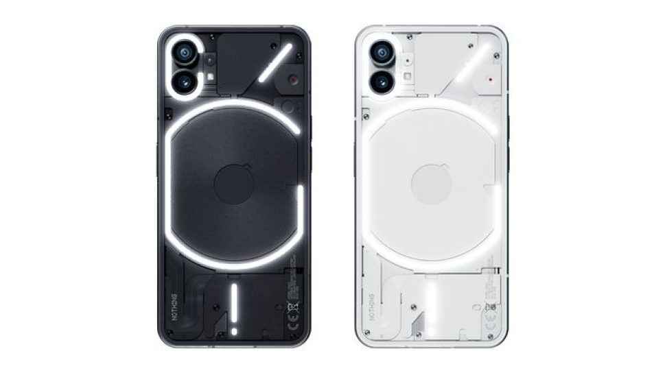
Nothing Phone (1). Weeks of hype, a system of invitations to buy it (although it is finally distributed in the leading stores), and the promise of making the phone market stop being boring. The aura of the initial OnePlus revives in this phone that, in addition to betting on software, wants to be a small revolution in design.
We have analyzed the Nothing Phone (1) in-depth, we have squeezed it thoroughly, and we are going to tell you all the good and all the bad so that you can determine whether or not it is worth betting on this “different” proposal.
Screen: Nothing Nothing new under the sun
The Nothing Phone (1) screen has AMOLED technology, a maximum refresh rate of 120Hz, and Full HD+ resolution. The summary is quick: it is a sufficient screen for the mid-range but lacks maximum brightness. The typical top value is 500 nits and can reach 1200 nits occasionally in certain content, such as HDR playback.
The Nothing Phone (1) screen looks good on paper and is well calibrated, although we miss a bit of brightness in the sun.
For practical purposes, it moves in full sun under those 500 nits, so we quickly notice the lack of brightness. The refresh rate is not adaptive and moves between 120 and 60 Hz, without intermediate values.
The calibration exercise is pretty good, with colors not too saturated in sRGB mode and a good amount of sharpness. Except in situations of very high light, it is a panel that is enjoyed, and having symmetrical frames without any curve makes the experience even more satisfying.
Nothing Phone Screen
The customization options are the basic ones of Android. We have a vivid colors mode and a standard mode (those modes are still untranslated), with an opportunity for dark theme, white balance calibration, and little else. Some users may miss a little more customization, but this mobile wants to be as clean as possible in software, and this is the tribute in return.
Performance: full of balance, lacking in ambition.
The heart of this Nothing Phone (1) is the Qualcomm Snapdragon 778G+, a custom version for the company. It is a mid-range SoC with an excellent general balance, but it always makes it clear that we are not dealing with Qualcomm’s eight series.
The Nothing Phone (1) performs smoothly, lag-free, and smoothly. However, with this software and the ambition to last so many years, a little extra power would have been great.
There is no lag, the phone is smooth, and even the heaviest games, like ‘Genshin Impact,’ run well enough (on high settings, but not on ultra). However, we sometimes miss a little more punch and seeing that the competition is betting on these price ranges for proposals such as the Snapdragon 870, we are stuck with the thorn of having a little more power.
A key point to note is that this phone wants to be updated for four years (three major system updates and an additional year of security patches). Here it is imperative to choose a platform with the power to spare since it is necessary to perform today and how it will perform with Android 15. The future will tell.
Design: LEDs, cameras, and action
More than likely, you want to read about the LEDs of the Nothing Phone (1), so let’s quickly go through the rest of its construction since there are not without relevant points. This phone has a transparent back, revealing a sheet designed by Nothing. We do not see the hardware elements themselves (processor, battery, sensors, etc.) except the wireless charging coil but the trims above it.
The design of the Nothing Phone (1) is undoubtedly striking. The main drawback is that it gets covered in fingerprints, making it difficult to wear.
This bet is striking, and it is good news when mobiles are very similar in design. Drag, however, has two cons. First, it’s filthy, at least on our black unit. A mobile born by and to show off the back should not be covered with fingerprints so easily.
And the second is that it is a carbon copy of the iPhone to such an extent that, if we see it in profile, it is practically indistinguishable from the Apple terminal. It shouldn’t be a big bother that this phone is “inspired” by the iPhone, but the resemblance is such that it was mandatory to comment on this aspect. The construction materials are aluminum and glass covered with Gorilla Glass 5, so there is no major problem with its final quality.
Ergonomically, it approves. It’s a bit slippery, but the flat edges don’t dig in, it’s narrow enough not to get in the way when held in one hand, and the low weight is appreciated.
The Nothing Phone (1) has made it recover the illusion of a mobile launch, which is not a good sign for the sector.
In Engadget Android
The Nothing Phone (1) has made it recover the illusion of a mobile launch, which is not a good sign for the sector.
Looking at it from the front, we find symmetrical frames (miracle!), something challenging to see on Android. This is achieved thanks to the flexible OLED panel, which can be bent to avoid the typical chin we usually find. There’s some front bezel, but the formula works wonders aesthetically, and the small front hole isn’t distracting.
The Nothing Phone LEDs
If something has caught the attention of the Nothing Phone (1), it includes different intensity-adjustable LEDs (as a whole, not individually) on its back. The company calls this proposal Glyph design, and the objective is to transmit information to the user without the need to interact with the phone. What can we do with these lights?
call indicator
Notification indicator
Charge level indicator
Reverse wireless charging indicator
Support light in photography
Google Assistant response indicator (not active yet)
